Table of Contents
Website navigation can make or break visitor retention. It gives your site structure that steers your visitor along with the right flow. Learn the types of navigation and tips on website navigation design from the best Web Design Company in Chennai.
Types of website navigation
The Classic Navigation Header
This is by far the most common website navigation feature. It is in the form of a menu that is placed horizontally over the home page’s main content.
Side Bars
This is a list placed in a vertical arrangement to the left or right of the home page. However recent design trends have given it a central place of prominence.
Split Menus
These are also a recent trend in website design. The menus are split up and placed alongside the relevant content on the home page.
Hamburger Menu
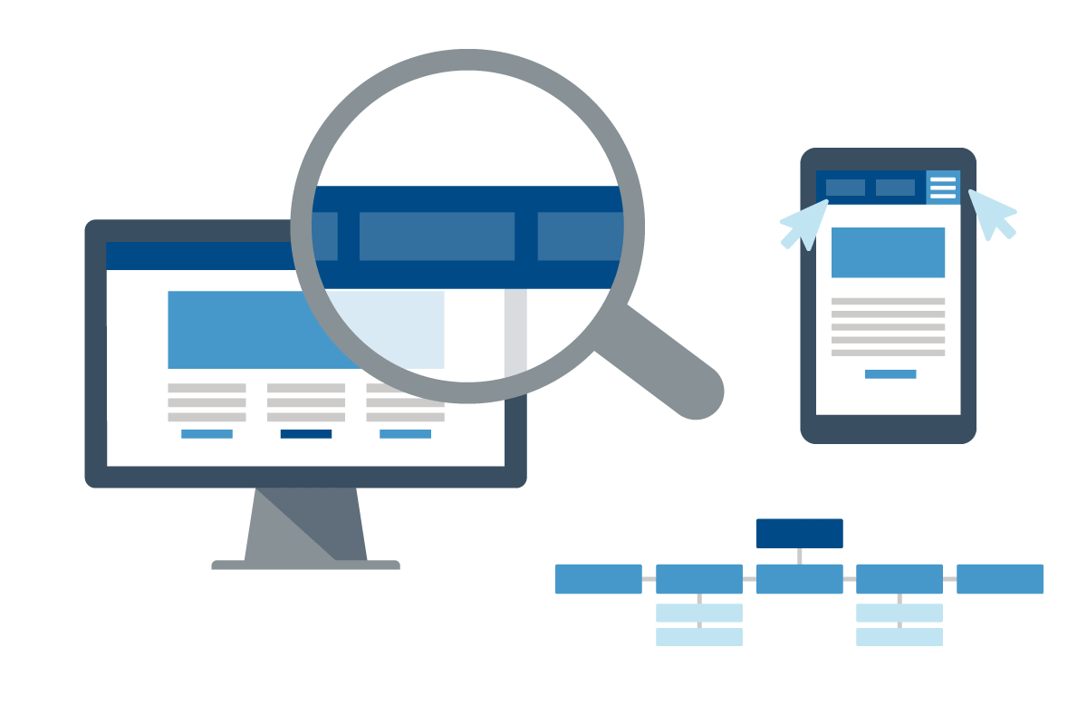
This menu is represented by an icon – three horizontal dashes against a solid background. You can access the menu by clicking on it. It expands or cascades down to display the links.
Website Footers
Website Footers are another position of interest for navigation links. Even at the end of the page, a user has access to other pages through the navigation links on the footer.
Now that you know the types of website navigation options there are available, let’s learn how to make website navigation efficient and easier for the user.
Create a Sitemap
When planning a trip to an unfamiliar destination, one normally plans their itinerary using a map of the location. Now think of your website as an unfamiliar territory to the visitors. Plan your website in the exact trail that you want them to follow. Create a Sitemap, a list of all the pages, and the subcategories within them. Sort them out according to their importance or relevance to the visitor. Design the flow of your website in the same hierarchy.
Let the Links Pop out
If your visitor cannot make out the hypertext from the rest of the copy, then the website navigation becomes a hassle. Let the links pop out even if the pointer isn’t hovering over them. Web Design and Development services use different fonts, make it bold, go with different colours, or design it as buttons. This will surely get your visitor’s attention.
Optimise the Navigation menu
Check the number of direct links on your navigation menu. If there are too many of them, then the navigation bar is going to look cluttered and confusing to the user. Start with which of the links can be categorised under others. Your Sitemap will be of great help here. Then design the navigation bar with the main links with the sub categories cascading under them. The main headings should clearly communicate what would lie within them.
E.G: If your site sells furniture, Home Furniture and Office furniture would be the main headings. Items like Tables, Sofas, Beds, Stools, and Chairs would be the subheadings. Further subdivisions would be the different types from each item.
Separate the Side Bars
The Side bars must be distinct from the rest of the website copy. The Best web Design companies achieve this with different colours and with plenty of space from the rest of the content. Give it a little 3D formatting to make it jump out of the page.
Standardise your navigation bar
People are accustomed to expecting things to be in a certain place on a website. This applies to the navigation menu too. The most preferred spots are the header, sides, and footer. Even if you want to break trends in website design, the best web design companies will recommend sticking with these oldies.
Mobile Optimisation for Navigation
The Navigation menu must be optimised for mobile screens. Avoid large menus that stretch horizontally. Vertical side bars with cascading menus work better on mobile browsers. Mobile sites are a classic location for Hamburger menus. Make sure the links are big enough for people with large fingers to click.
Open Designs, the best web development company in Chennai, has helped design thousands of successful websites. We have created the most convenient online user journeys that have guaranteed conversions for our clients. Make your web design count with Open Designs.


