Table of Contents
The year is 2020 and most everyone spends their time staring at one screen or another. Be it computers, laptops, or phones, long hours spent looking at their display is sure to cause significant damage to the eyes.
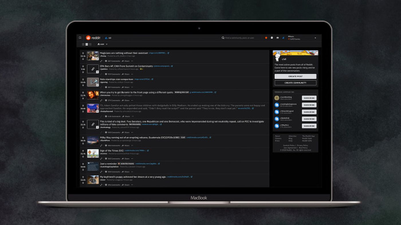
While the phone tech companies came up with eye protection warm light, web design and development companies came up with the Dark Mode Web Design to reduce eye strain. There are several more benefits to the Dark Mode and why you should feature it on your site or app.
Health Benefits:
As mentioned afore, the dark mode enabled screen causes lesser strain than the white screen normally would. This is especially helpful at night or in a room with the lights out. A white screen would be stark, while dark screen helps the eyes adjust to the ambient light.
Blue Light exposure suppresses the production of Melatonin, the sleep-regulating hormone. The lowered hormone levels can lead to obesity, insomnia, headaches, neck and spine strain, and can even cause cancer. The Dark mode screen mimics the natural light around us, even in the case of daylight.
Power Saving:
Mobile phones and Laptops are quickly drained off power due to excessive usage and running multiple applications. In devices with an OLED or AMOLED screen, the determined power saving has been up to 60% even at 100% brightness. In fact, after switching to DarkMode, Youtube has reported a 15% Energy savings at 50% brightness. This helps save up on battery power, especially when we have to go long hours with no access to chargers or charging points. This feature has enabled web design and development companies to encourage longer retention rates on their sites and apps.
Minimal Glare and Distraction:
When using a white screen there is too much empty space emitting blue light. This causes a glare that creates a strain on the eyes. The contrasting space is a visible distraction that takes attention away from the content and visuals. Dark Mode remains visually soothing, while the white lettering and other colours pop out. Web Design and Development companies use muted colours that are easier on the eyes and require less power to display.
Visually Appealing
Compared to the archetypal white screen, the Dark Mode screen has a certain glamour to it. Black has always been associated with Class and Elegance. The images seem to come alive from the screen on a black background. It looks aesthetic while also having a functional appeal. Many of the entertainment apps have introduced the Dark Mode option, and have reported increased usage. Polar, an Educational support platform polled its users on whether they preferred Light or Dark Mode. The results came up that 95% of the users actually switched to dark mode.
To accommodate users who still prefer the white screen and for use in bright lights, web design and development companies designed a toggle switch to shift between light and dark modes. In addition to this, there is an automated option to adjust the screen display according to available lighting and battery power. The automated feature is one of much convenience and welcomed by users everywhere.
Open Designs is a Web Design and development company based in Chennai, India, that has been a forerunner in developing ergonomic user interfaces. Soothing visuals and better energy savings have made the Dark Mode a favourite among our clients. Go Dark to brighten the future of your business


