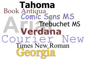
The art of arranging type, to make the content readable and appealing, is called Typography. The key elements of typography involve Line length, Line spacing and Kerning (spacing between individual characters), besides Typeface and Fonts. The major difference between typeface and fonts is,
Typeface: Family of fonts with similar features.
Fonts: A particular typeface with a specific size, style and depth.
Content are made to engage readers. Fonts helps them do just that. Fonts can influence readers’ moods and impact their decisions. Particular fonts are chosen intentionally, to motivate readers, to drive them to take decisions and influence them to share their experience.
By adopting a few creative ways, fonts can be enhanced effectively to engage your audience efficiently.
Matching font style to your brand
Fonts have qualities unique to every one of its ‘appearance’. It is essential that the font you choose exude the spirit of your brand. For instance, a cosmetics brand would use a font style which radiates feminity, and a brand of toiletries for men would use a geometrically shaped font, that exudes masculinity. The font you choose should reflect your brand’s personality.
Readability
The font choice determines its readability. Especially so in social media, where the attention span of your reader is determined by external criteria. Unnecessary styles or illegible fonts would cause strain in the eyes of your readers and make it hard for them to read your content. Clear, legible fonts with appropriate punctuations will make reading easy.
Pairing fonts
Different kinds of fonts can be paired together to emphasize on an idea. Colours and background complement this strategy.
Contrast font colours against its background to enhance legibility. Using a lighter background and a darker fonts will reduce the strain on the eyes and is a better option.
Mobile-friendly sizes of your choice of fonts will help its readability, as mobile devices allow images to expand only to a certain size.
Social media platforms have their individual specifications of image size. Conforming to it would reduce the risk of words being cropped. Hence, typography should suit the norms of that particular social media platform it is used on.
The norms of the social media platform you choose to market in, should be complied with effectively. For instance, Facebook insists that the text in images be less than 20% of the image.
Typography can decide the reachability of your content. It communicates the thought expressed in your content. When done right, it makes your customer engagement very effective. Match the platform with your style of expression and effect a successful engagement.


